
CIVICS MATTERS
A first look at the complete visual direction for the Civics Matters experience, the interface, the controls, the mini-game workspaces, the type, the sound and six complete worlds we could build in. Every frame is finished artwork and every sound and music cue is real, so you can hear and see the direction rather than imagine it.
Start with the interface. Then choose a world.
Use Back and Next at the top of the screen, the dots below, or your arrow keys. We begin with the interface and type system every direction shares, then walk through the six visual worlds.

What the student actually touches
The interface is designed as part of the world, not laid on top of it. Below are working components (the decision prompt, the achievement chip, the progress rail and the evidence panel) shown over a finished scene.
VOTE BOARD
EVIDENCE CARD
Every control has five states
A student should never have to guess whether a control is available, already pressed, or waiting on them. Hover, focus, pressed and disabled are all designed, and every drag interaction has a select-and-move alternative for keyboard and touch.
One button, six worlds
The voice of the product
Three roles. A display face that carries personality and shouts when it needs to, a handwritten face for the student's inner voice and marginal notes, and a highly legible UI face for everything that must never be misread.
Display: Bangers
THE FLOOR!
Voice: Patrick Hand
Interface: Rosario
Core palette
Evidence becomes an argument
In Journey 3 the learner sits in a real committee hearing, keeps the statements that matter, and attaches them to a clause of the bill. The reasoning they write becomes visible in the bill's margin, and a representative challenges it on the floor later.
Live testimony · Journey 3, Committee
Evidence tray
The bill: Section 4
Route A: local flexibility
Route B: student opportunity
Route C: purpose first
Route D: listen first
From scattered notes to a plan you can defend
In Journey 5 the learner gathers evidence, groups it on a case board, and builds a live action plan. Eight substantive notes and two groups are required, and filler can't complete it. In Journey 4 the same workspace becomes five launch workstations with real dependencies.
Case board · Journey 5: community issue
Contributing factors (5)
What we still need (3)
Action plan · eight coverage areas
The same decision, six worlds
This is the identical moment in the game (one amendment, three choices) dressed in each of the six directions. This is the clearest way to feel the difference, because the interface is where a student actually spends their time.
Dialogue and status, three ways
The dialogue box and the status bar carry most of the screen time, so their personality matters more than any single illustration. Painted for warmth, comic for energy, glass for a modern register.
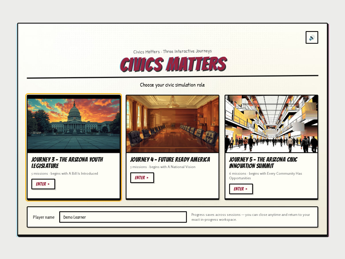
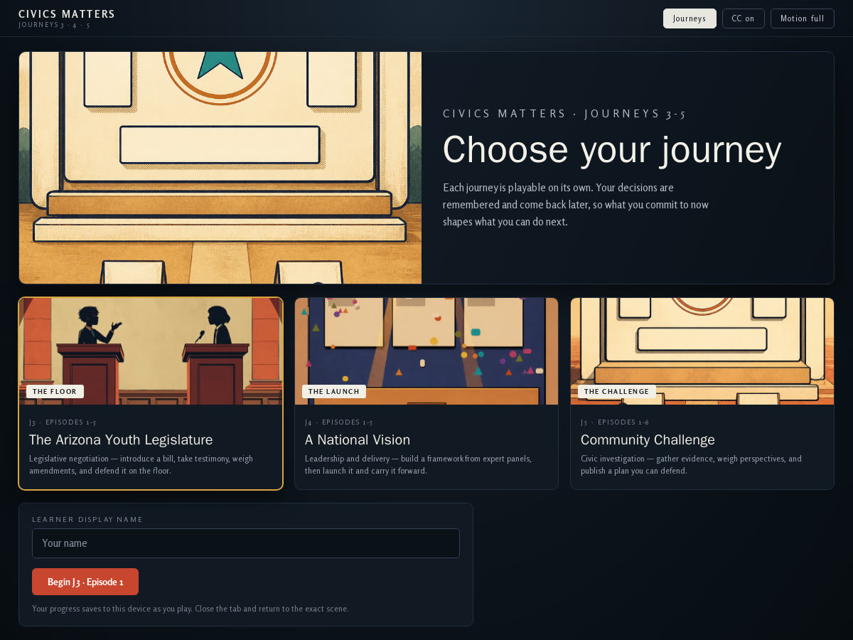
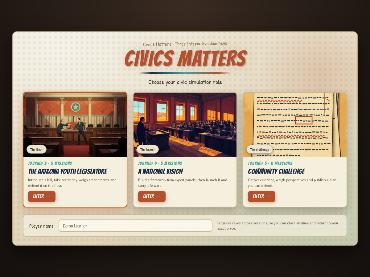
The journey menu, three ways
The first screen a student ever sees, shown in three directions. All three carry the same three journeys, the same mission counts and the same player-name field, so the only difference is the visual language.
The chrome every screen shares
These are the pieces a student sees constantly: the journey bar, the dialogue box, the notebook, the objective list and the reward confirmation. They are designed once and used everywhere, so the whole game feels like one product rather than thirteen separate activities.
Journey bar
Dialogue
Objectives & receipts
Reward & confirmation
Screens a student moves through
Beyond the in-scene chrome there is a small set of full screens: the entry point, the place a student chooses where to go, how progress reads back to them, and what happens while something loads.
MATTERS
A shared symbol set
One icon family used across every journey, and a character expression range that lets dialogue be performed rather than described. Icons carry no text, so they have to read at a glance on a school Chromebook.
Neutral
Concerned
Determined
Welcoming
Built for a school Chromebook first
This is a classroom product, so the smallest screen is the one that matters most. Every layout works on a laptop or Chromebook, scales up to a classroom display, and adapts to tablets and phones without losing the work area.
Recognition the student can keep
Badges are earned for genuine work: a connection made, a plan defended, a bill carried. They re-skin to whichever world we choose, and locked badges show what's still ahead so the path stays visible.





Every real action gets a sound
Short, restrained effects that confirm what actually changed: a document edited, a promise made, a point earned. They are never the only feedback: the visual receipt always lands too, and the whole game is completable in silence.
civics
documents
reward
tension
Pick a sound for a fifteen-year-old
We don't yet know which world you'll choose, so here is the music question on its own. Four genre families, two directions each. Play them and tell us what feels like the game you want to build. All of these can sit under dialogue without fighting it.
electronic
Or a bed for each journey
If you'd rather the three journeys each had their own score than sit under one genre, this is that version: one warm main theme and a distinct underscore per journey, so the stories feel like three different rooms in the same building.
One world, drawn by one hand
The clearest improvement available to us is consistency. When characters and environments are created in the same visual language, students stop seeing a product and start believing a place. Each direction below commits fully, and each one commits differently.

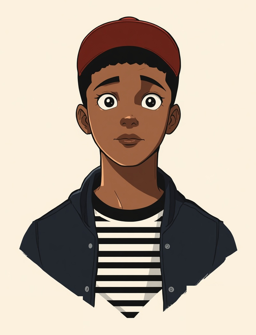
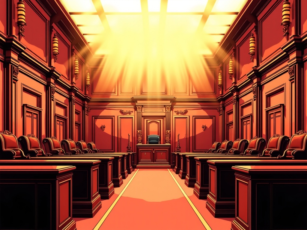
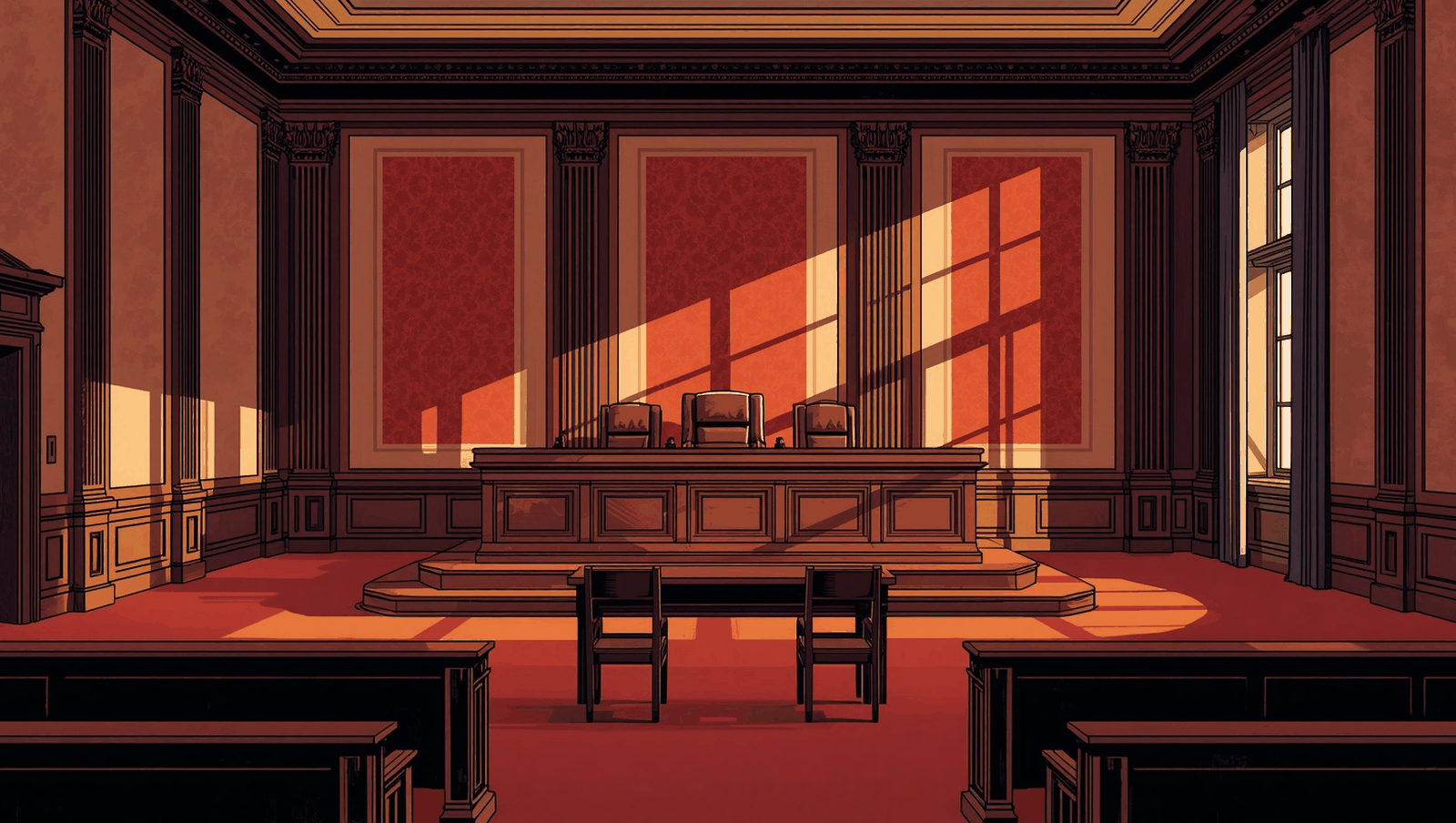
Hand-Inked Painted Print
Painted brushwork with paper grain, soft ink contours rather than heavy outlines, halftone shading, and a warm terracotta, cream, navy and turquoise palette. Characters and environments drawn by the same hand.
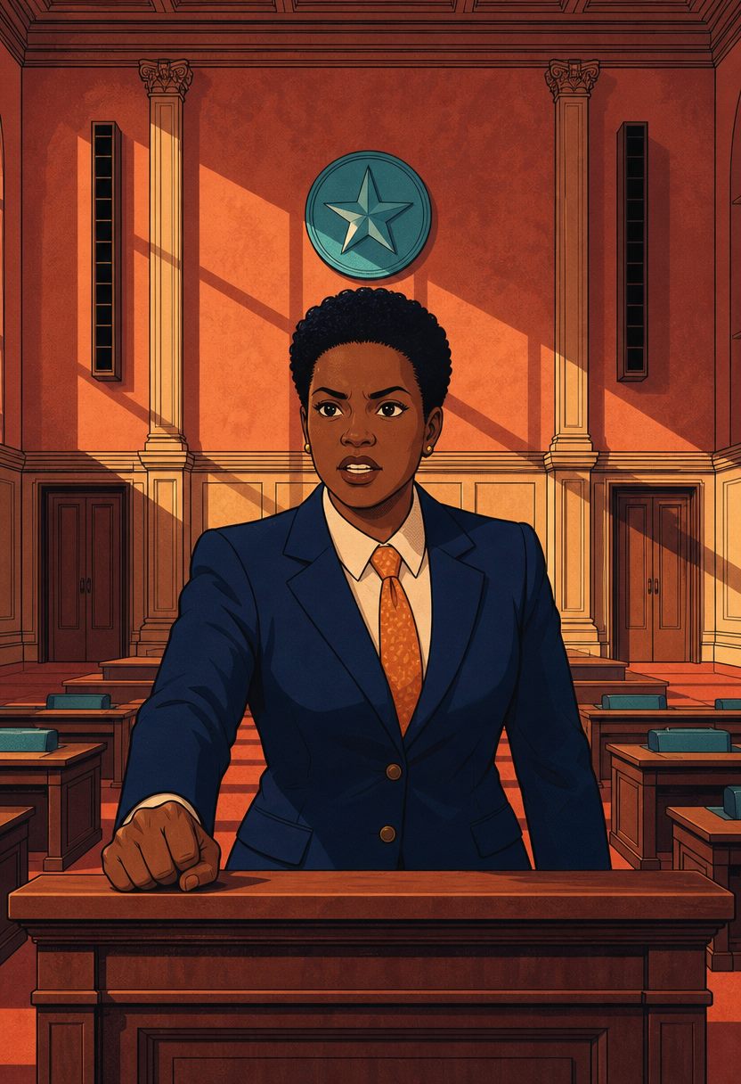
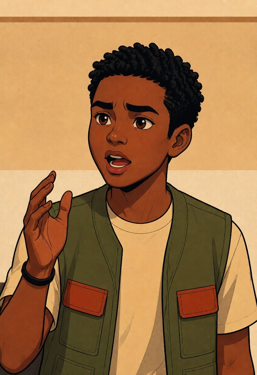
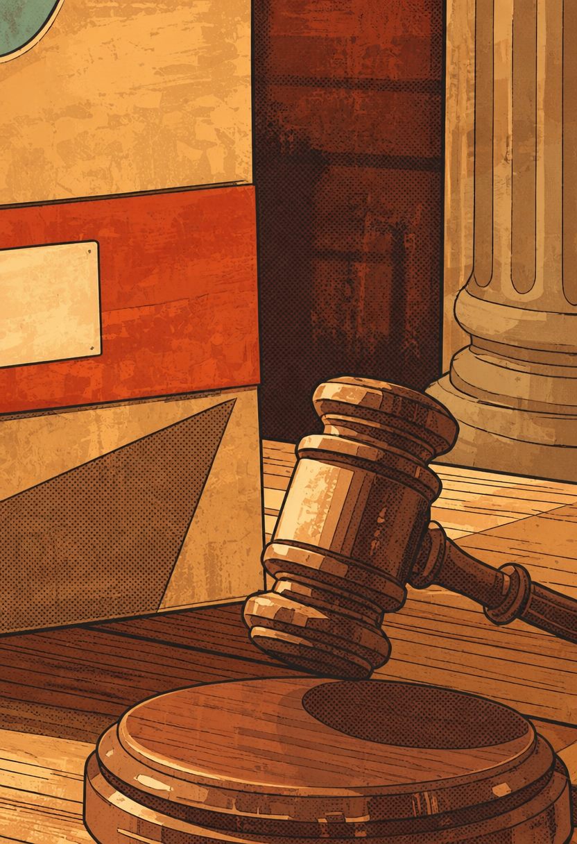


Characters are designed with a full range, neutral, concerned, determined, passionate, stern, welcoming, so dialogue can be performed rather than described.
Warm, editorial and genuinely characterful. It carries serious subject matter without tipping into corporate or childish, the hardest balance for a teen audience.
Clean Modern 3D Render
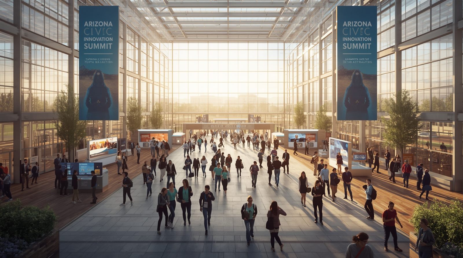
Photoreal architectural rendering, warm sunlight, timber ceilings, sunlit civic space and a diverse contemporary cast. Aspirational and immediately legible to any audience.
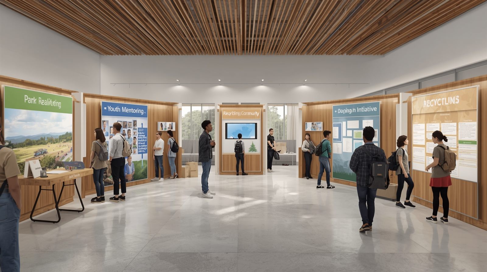

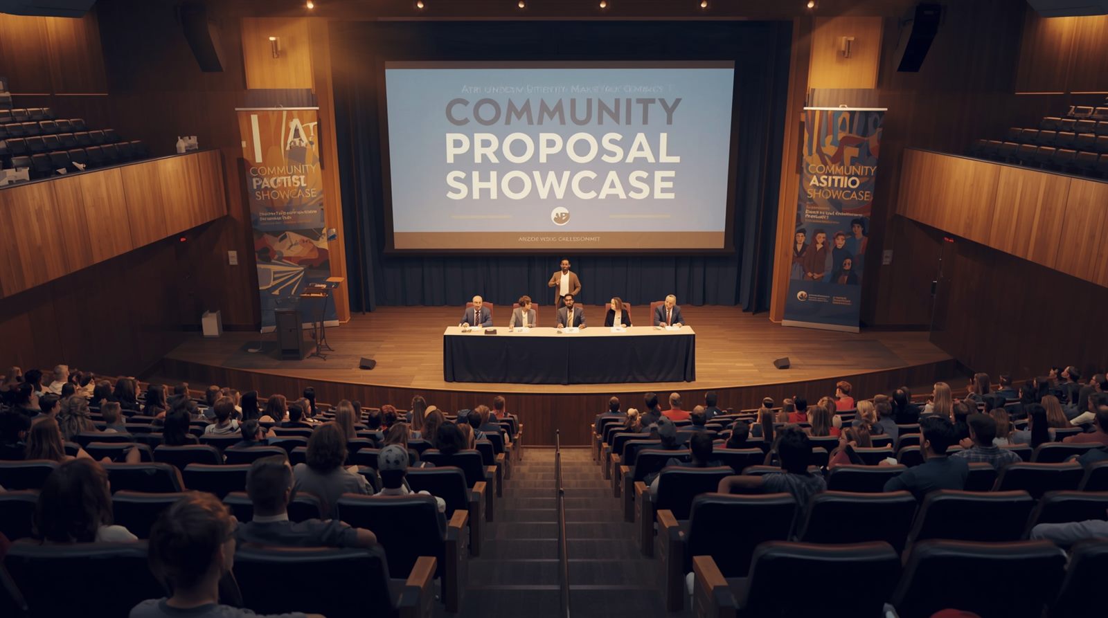

Photoreal throughout, and the cast looks like contemporary Arizona. Nothing to explain, people understand it instantly.
Rendered environments can read corporate and calm. Stakes and conflict are harder to express in a space this serene.
Strong for a summit or showcase setting where the mood should be optimistic and forward-looking.
Stylized 3D Character
Animation-grade 3D characters, appealing and clean in silhouette, set against cinematic rendered environments. The most future-proof of the six.
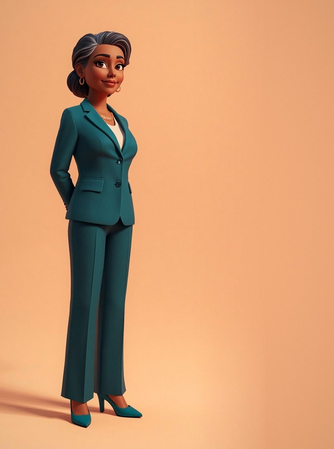
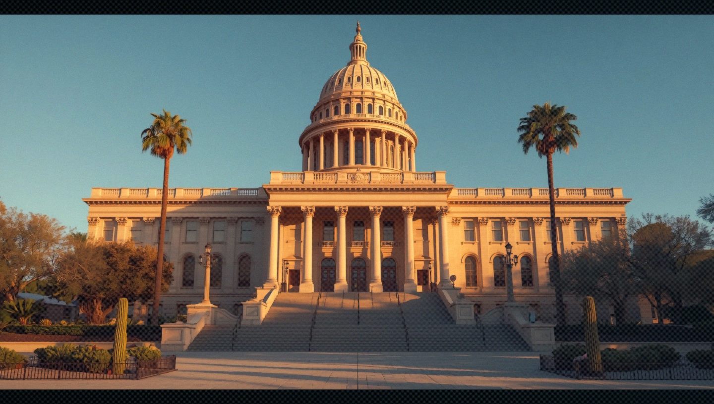
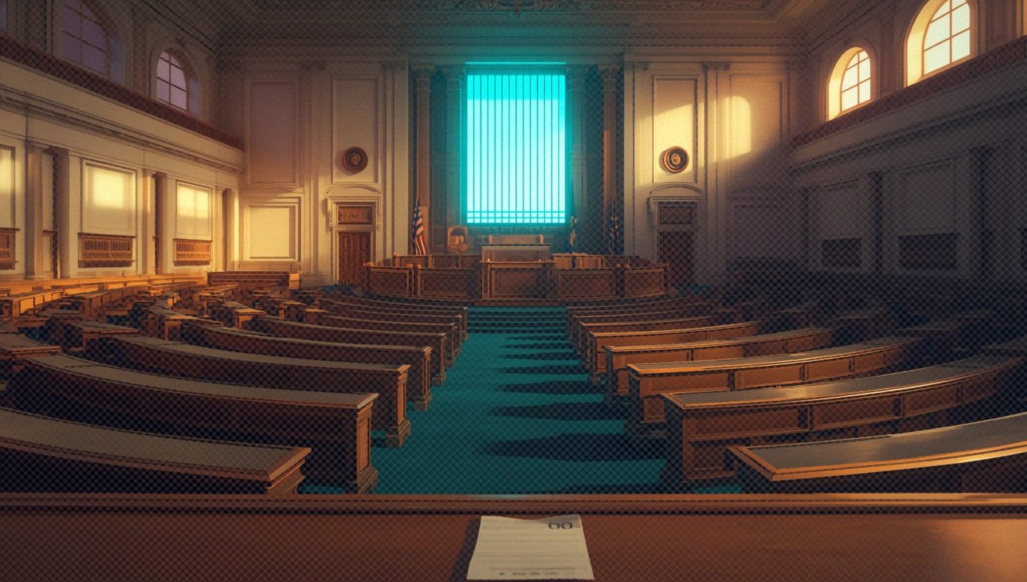
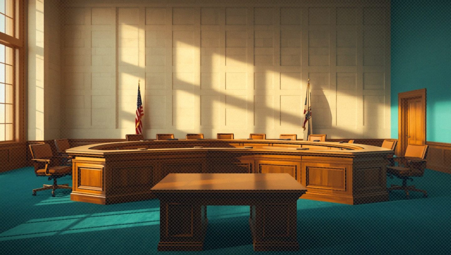
These characters are riggable. The strongest foundation if you want true character animation, performance, gesture and movement, later on.
The characters and environments currently sit in different registers and would need bringing into balance.
Best if animation and character performance are a priority and the budget supports 3D production.
Capitol Zine
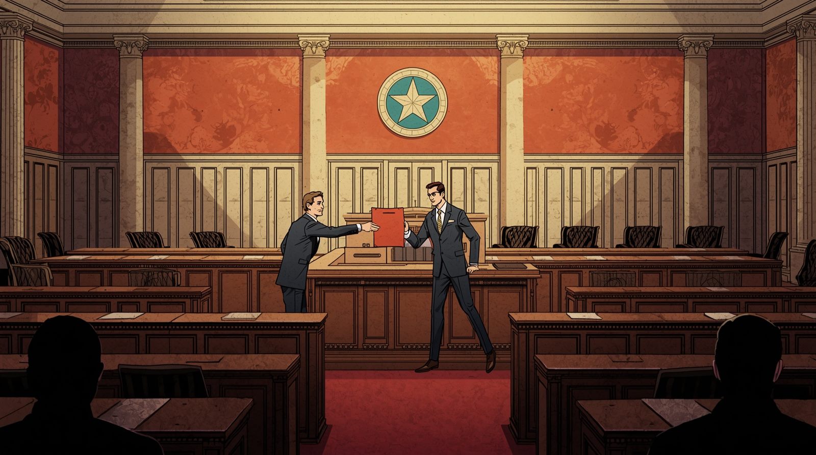
Screenprinted comic. Bold ink, ben-day halftone, a five-colour spot palette and deliberate misregistration. It looks like something students made themselves, which is entirely the point.
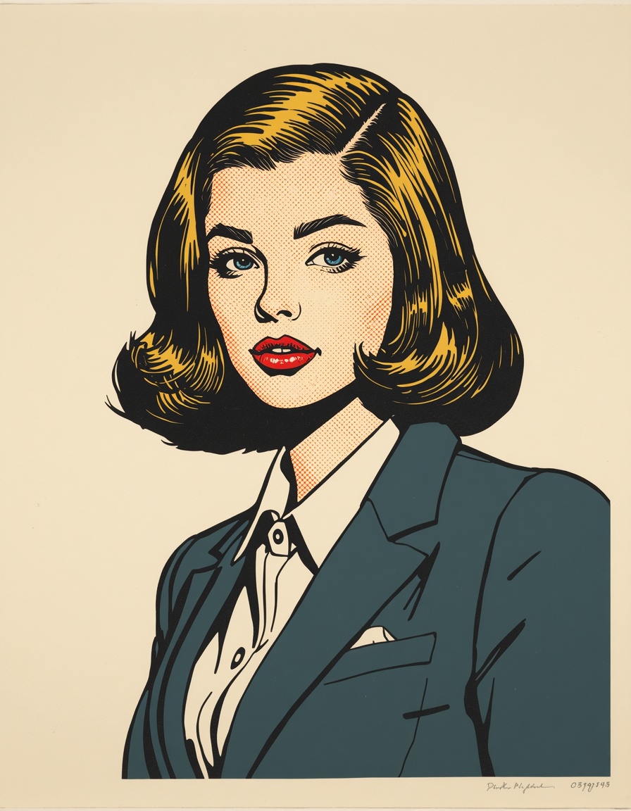
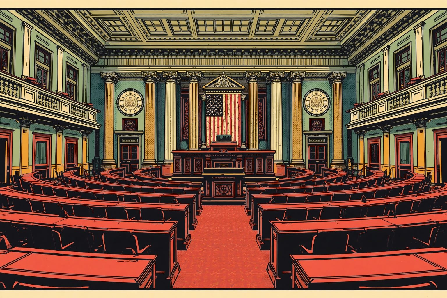
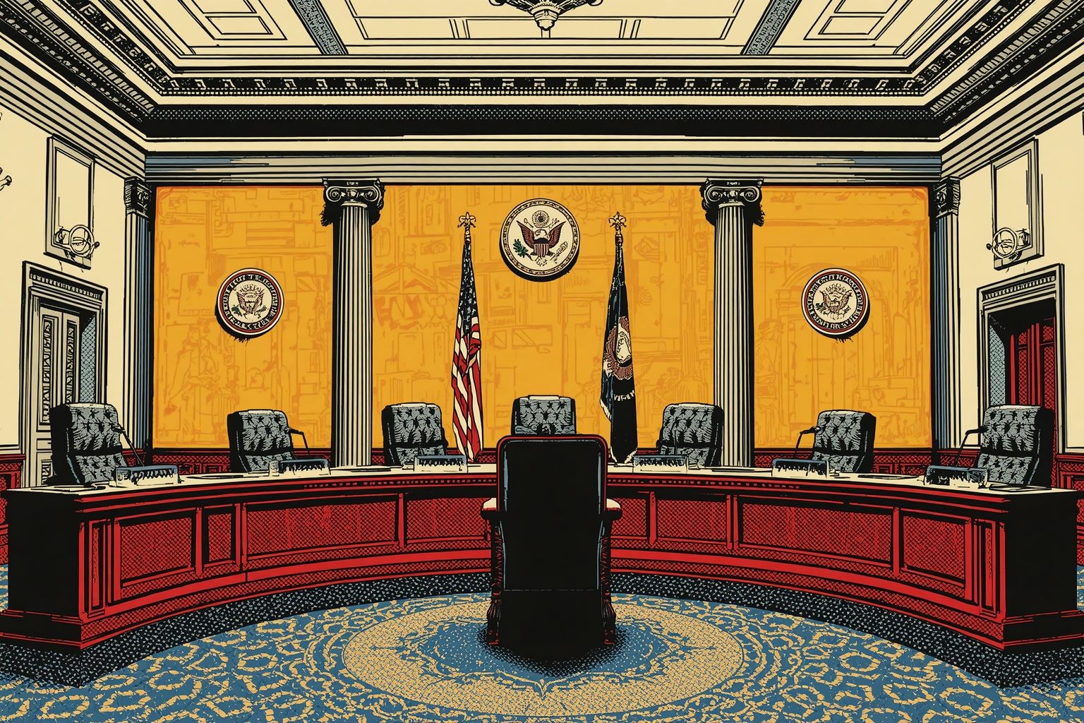
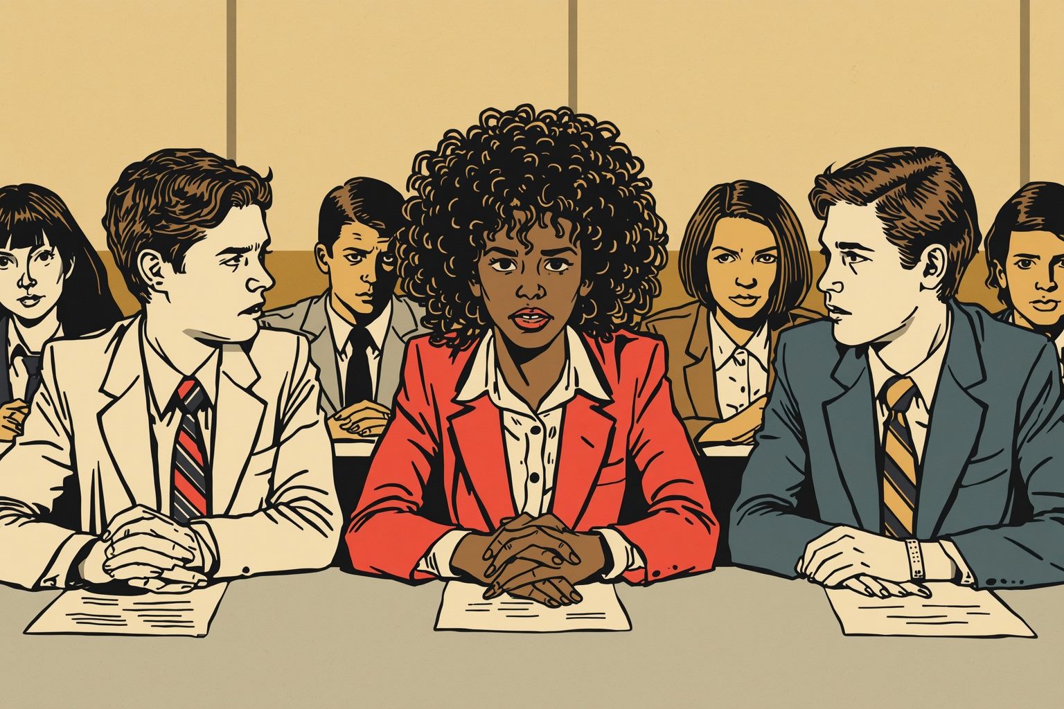
Bangers and Patrick Hand, loud, hand-made, unapologetically youthful.
The boldest direction here. Energetic and irreverent, and unlike anything else in civic learning. Maximum teen appeal.
Graphic Novel
Painted prestige comic. Chiaroscuro lighting, a limited palette per scene (warm amber in the hearing room, cold blue at the vote) and visible brushwork throughout.
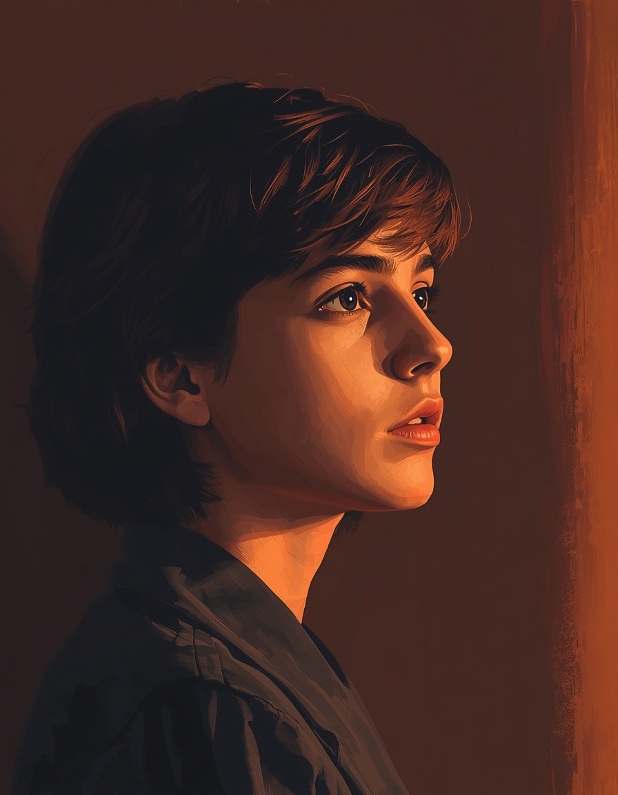
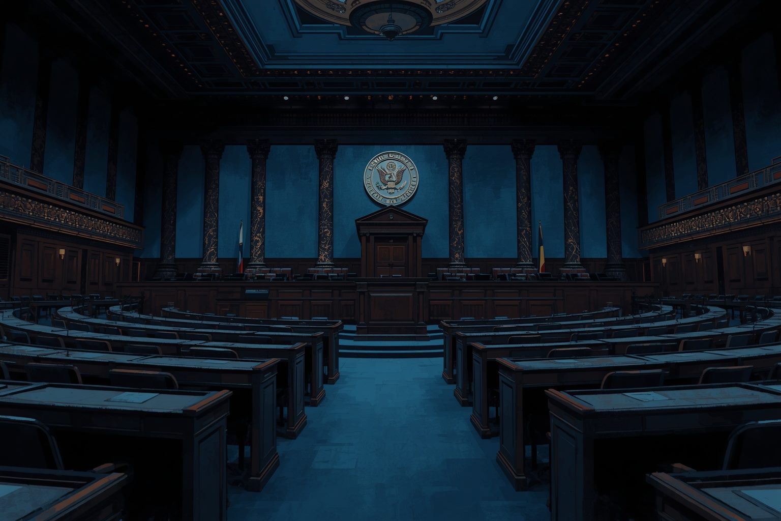
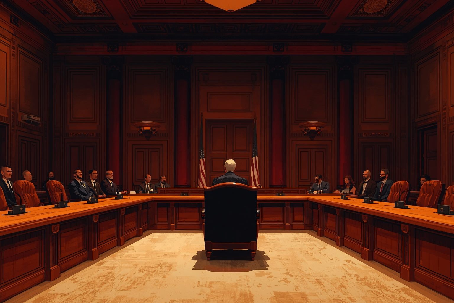
The most gravitas of the six. It feels like serious drama and gives the subject real weight.
Darker and more adult in tone. Beautiful, but it reads older than the other directions.
Modern Flat
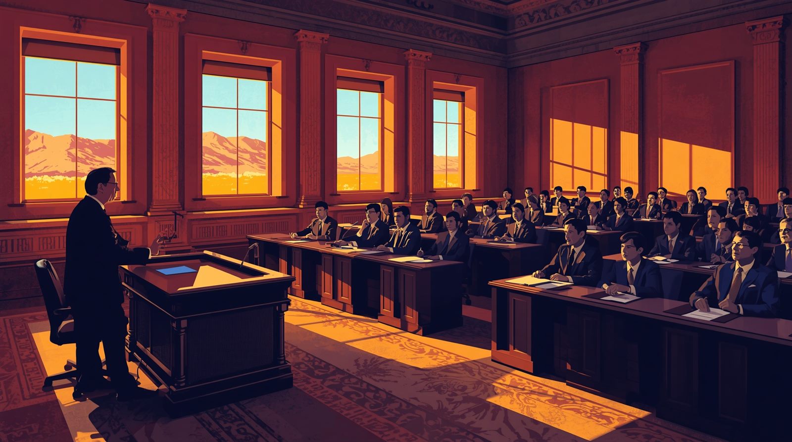
Clean geometric vector. Flat fills, no gradients, high-contrast complements. The most animatable of the six and the easiest to keep perfectly consistent across every journey.


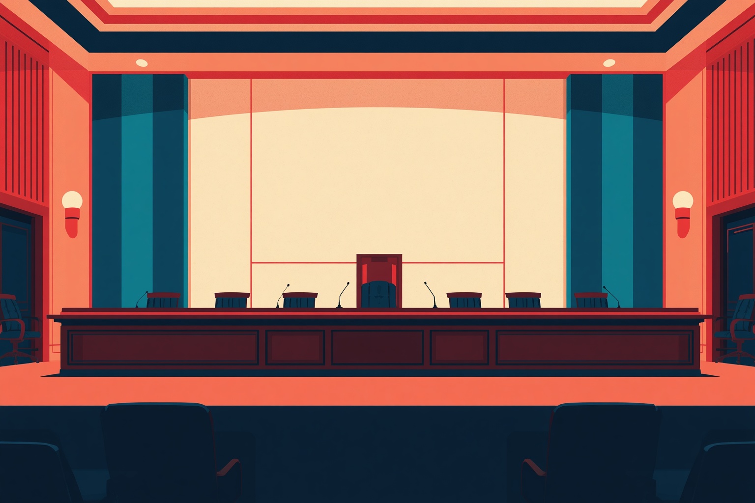
The most economical to produce and animate, and the easiest to keep consistent at scale.
Clean and safe, but the most generic. It could belong to almost any product.
Motion brings the world to life
Six directed shots rather than generic loops. Each one is built with a specific camera move, lens and lighting intention: crane descents, portrait push-ins, over-the-shoulder testimony and a spotlighted tally board. Six seconds each, playing automatically so you can see the movement.
The same brief, six ways
A character and an environment rendered in each direction, so the difference is easy to judge at a glance.


Where we'd take it
Lead with 01, Hand-Inked Painted Print
It is the strongest work in this set. It draws characters and environments in one language, it carries serious subject matter with warmth rather than corporate polish, and its full range of character expression means dialogue can be performed rather than described. It is also the most distinctive, nothing else in civic learning looks like it.
Use 02, Clean Modern 3D where the story opens up
Where the experience should feel optimistic and forward-looking, the rendered direction is the natural fit. It gives us a deliberate change of register at the moment the story expands.
Borrow the boldness of 04, Capitol Zine
Rather than adopting it wholesale, we'd use its graphic energy on the interactive surfaces, the vote board, the markup tool, the evidence wall, the achievement emblems. Energy where the student acts; warmth where the story lives.
What this gives you
One coherent world instead of two, a proven motion language, and a visual identity that is unmistakably its own, which is what makes it memorable to the students who use it.
Everything you can choose
No rush, and no wrong answers. This is just the list of decisions this board is asking you to make. You can pick a direction, a sound and a device priority independently of each other.
What we produce on approval
1 · Style guide
Line weight, shading technique, the full palette with values, lighting rules per scene type and a character construction guide, one page per system so everything stays consistent.
2 · Character set
The complete cast across all journeys, each with a full range of expression states ready for dialogue.
3 · Environment set
Chamber, committee room, capitol exterior, breakout rooms and summit floor, each lit for its scene.
4 · Prop & interface kit
The bill, evidence cards, activity surfaces, vote board and achievement emblems, built as live components.
5 · Motion package
Establishing beats, branch outcomes, transition language and interaction stings across all journeys.
6 · Playable episode
One episode built end to end so you can experience the direction in play before we commit the rest.